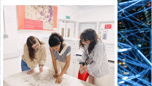
Research Data Services in the Northeastern University Library, Campus Planning, Real Estate & Facilities, and the School of Public Policy and Urban Affairs recently celebrated GIS day 2022, along with the NULab. The event showcased the University community’s work in geospatial projects with a keynote speaker, workshops, a poster and StoryMap competition, and short, in-person and virtual presentations.
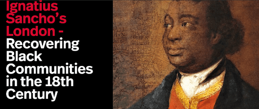
The presentations were kicked off by Northeastern University London’s Dr. Oliver Ayres and Northeastern University Boston’s Dr. Nicole Aldjoe, and their researchers, Odile Jordan, Libby Collard, and Ellen Valente. Their project is called Ignatius Sancho’s London: Recovering Black Communities in the 18th-Century London Metropolitan Archives and the ‘Rediscovering Londoners’ Exhibition. It maps 18th-century London through the eyes of Black British writer and composer, Charles Ignatius Sancho, using archival research of his preserved letters. “The goal was to digitally map his life […] using his own letters to do so,” said researcher Odile Jordan. Researcher Libby Collard noted that their work identified discrepancies between historical maps of the city and place names used in modern maps, and deciding how to deal with these differences was an interesting methodological question for their team. The differences in place names shows how areas of the city have changed uses and residents over time, and it was not the only difference their study uncovered. Through Sancho’s preserved letters, their project mapped the spatial range of Black communities across 18th-century London and illustrated the spatial range of Sancho’s wider social network. Prior knowledge of 18th-century London told of Black Britons being located in pockets of the city; however, their mapping of London from Sancho’s perspective revealed Black British communities interspersed across the city. Their map of the past city landscape makes London’s, and the United Kingdom’s, history more accessible to the public, allowing families to identify the unique places associated with their heritages, and making it clear that Black British history is British history.
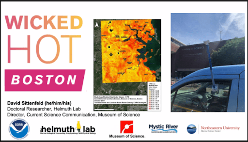
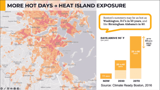
From the NU Marine Science Center, Dr. David Sittenfeld and their research team presented their collaboration with Boston’s Museum of Science, the Mystic River Watershed Association, the Resilient Mystic Collaborative, and the Metropolitan Area Planning Council. This project, called Wicked Hot Mystic, looks at differences in exposure to extreme heat across Boston and uses citizen scientists to create more equitable resilience planning. “This research is a part of a national heat island mapping campaign” to help communities take action to reduce heat stress and associated health impacts.
The project engaged 50 citizen scientists, who collected hyperlocal heat data by driving around with temperature sensors to get geo-located heat data at 4 times of day to identify trends in heat across the city at different times of the day. The citizen science data was compared against stationary temperature sensor data, and they found large discrepancies in heat index across the city with environmental justice communities having hotter hyperlocal temperatures. According to Dr. Sittenfeld, the hottest location their study found was in Dorcherster, and was “ten degrees hotter than what was reported at Boston Logan.” Their project identifies that hyperlocal heat exposure can differ greatly from the temperature being reported. These areas with hotter hyperlocal temperatures are located far away from water, have less tree canopy, have more impervious surfaces, and are typically areas with communities of color. Their study found that being located in a redlined neighborhood exposed people to 2 degrees more heat than those neighborhoods that were not redlined. The disproportionate heat impacts exacerbate existing health issues and community harms: for example, there are traditionally higher rates of asthma in these communities, and high heat exposure worsens asthma.. Their study found that the amount of tree canopy and impervious surfaces are each significantly associated with greater heat exposure; policymakers can use this information to enact plans that reduce heat burden on already-vulnerable communities. Finally, the project’s interactive StoryMap of Wicked Hot Mystic allows the public to explore their findings and engage with community resilience planning.
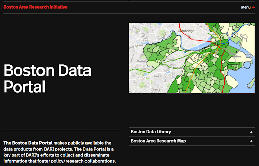
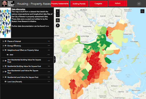
The lightning talks continued with another presentation of research focused on Boston. Professor Daniel O’Brien is Director of the Boston Area Research Initiative (BARI) group, and presented the group’s work to engender research-policy partnerships with the city of Boston with “Boston-based, community-oriented data.” Their most recent work applied large datasets of Boston to understand how the COVID-19 pandemic has interplayed with disparities across the city, and to collect neighborhood-level data on people’s experiences living in Boston during the pandemic. Another project that the BARI group has is in collaboration with the city’s 311 department. Their team analyzed nonemergency 311 reports to provide policymakers insights on how people are using the 311 service and demonstrating custodianship over common areas in the city. While the BARI group has many research projects, they also encourage use of their data for student and other individual research projects. The BARI team has the Boston Open Data Portal, hosted by the Harvard Dataverse, which offers a library of open data for users to access. BARI additionally offers data consulting services, to help people use the BARI open data for their own research projects. Knowing that not everyone has access to data analysis skills and tools, the BARI group has put together an interactive map of Boston that allows the broader public to explore property, environment, commerce, and other features across the city. The map allows users to answer questions about the city by providing different themed layers of the city, which show such information as housing value, commute times, heat islands, and more.
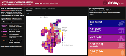
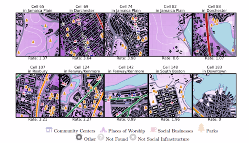
Dr. Timothy Fraser presented work adding to the robust geospatial research on Boston. Fraser is an Ezra Systems Postdoctoral Associate in the Systems Engineering Program at Cornell University, applying computational social science methods to understand how social networks aid people and communities adapt to the multiple crises of climate change. Dr. Fraser worked with multiple undergraduate and Masters’ students in the School of Public Policy and Urban Affairs and the Aldrich Resilience Lab to understand social infrastructure in the city of Boston. Dr. Fraser described social infrastructure as the “social ties among residents that enable trust, reciprocity, and support.” These social ties are created in certain places around the city, such as community spaces, places of worship, parks, and social businesses like beauty salons and barbershops. The study specifically asked which city blocks in Boston host the most social infrastructure. Using Google API, the project team assessed city blocks for social infrastructures. They then mapped the rate of social infrastructure by going in-person to verify social infrastructure located on google Maps using Map Marker. Dr. Fraser mentioned that during this verification process, their research team discovered new social infrastructure sites and sites that were excluded or missed from the API search. The results of their analysis are able to accurately predict the rate of social infrastructure for city blocks in Boston. This information is important for policymakers and communities because stronger social infrastructures can support community resilience: as Boston increasingly deals with crises onset by climate change, knowing where to increase and access social infrastructure will be important. The data is publicly available on the Dr. Fraser’s github.
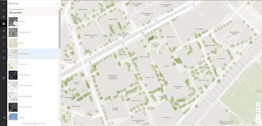
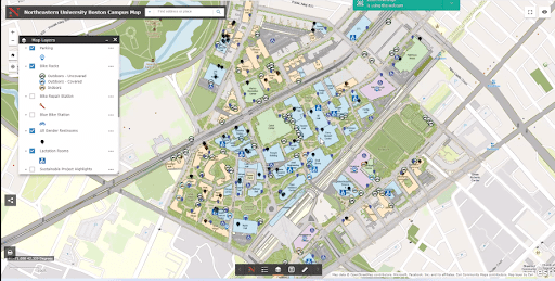
The 2022 GIS Day’s short talks concluded on a high note with a presentation by Negar Pourshadi, who is a Space & Planning Systems Manager at Northeastern. The team developed the Northeastern University’s Open Data Hub, and their geospatial project with the University Planning, Real Estate & Facilities group produced an interactive Campus Map. While most of the lightning talks were focused on research, this talk showed how geospatial tools can be applied for administrative use and planning. The administrative team worked with ESRI, developers of ArcGIS, to generate improved data about the campus, such as locations of trees, gender neutral restrooms, bike racks, and other local campus features. Their efforts have improved the accuracy of ArcGIS’s basemap for Northeastern University, enhancing how map users navigate campus and how campus leadership manages campus spaces. The map is publicly available because, as Negar Pourshadi noted, “it is important for the public to be able to access these locations” on campus. The interactive campus map is regularly updated as changes to campus occur, which ensures users can accurately navigate the campus and campus administrators have accurate knowledge of campus resources and features. The Open Data Hub for Northeastern provides public access to some of the data the group has gathered and categorized for the creation of the Campus Map. The administrative team are now working on mapping infrastructure features on Northeastern’s campus, such as building floorplans, underground utilities, and other critical infrastructure “for emergency management, and linking to management plans…[The map] is a general tool for the management of campus.” Moreover, the open access to some campus data allows students to conduct geospatial research on campus grounds and creates an avenue for students to get involved with campus management.
These lightning presentations highlight the University’s strong research tradition of applying geospatial analytical methods to social sciences and humanities research. Their applications of GIS demonstrate that innovative research methods can yield innovative results—results that may not be gleaned through traditional research methods. These presentations show that making research findings publicly accessible with GIS maps improves public involvement in local policy issues, and improves knowledge about modern public spaces and place-based history.
If you are interested in applying geospatial analysis to your work, or interested in learning more about the University’s GIS research, please visit Northeastern University’s GIS research services webpage.
