The Northeastern University Library, with support from the Global Resilience Institute and the NULab for Digital Humanities and Computational Social Science, recently celebrated GIS Day 2025 as part of an international series of events. The event showcased the University community’s work in multi-disciplinary, geospatial projects with a keynote speaker, a poster and StoryMap competition, workshop, and short, in-person and virtual presentations.
This year’s theme was: “Geo-Generalist Era: Where Spatial Meets Everything.” The theme highlighted work to apply geospatial analyses across multiple topics and disciplines to solve real-world challenges.
GIS Day 2025 began with an opening speech by Dr. Dan Cohen, the Dean of the Libraries. Dean Cohen highlighted the expansion of NU Libraries’ resources and collaboration across the university’s global campus network, and how GIS has become a tool for enhanced collaborations among disciplines. This year’s theme is timely, with generalist technologies such as GIS and AI becoming increasingly embedded in academic, non-profit, and business activities alike. Dean Cohen’s opening remarks ended with thank yous to GIS Day’s sponsors and organizers, including the GRI, NULab, Molly Brown, Bahare Sanaie-Movahed, Alyn Gamble, and the NU Libraries’ staff for running this year’s GIS Day.
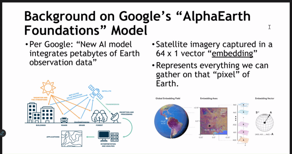
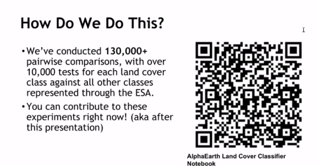
The presentations were kicked off by Justin Guthrie, a GIS Specialist at Enodia, and Research Associate at Northeastern’s Sustainability and Data Sciences Laboratory and Northeastern’s Defense Industrial Base Institute. Mr. Guthrie’s presentation, entitled “What on Earth is AlphaEarth?” opened the “black box” of complex, geospatial foundation models. These models accurately predict and classify environmental data based on decades of archival satellite, radar, and sensor data, yet make it hard for data scientists to understand how the encoded data vectors actually represent real-world geophysical processes. Satellite imagery is captured in a 64×1 vector, or “embedding,” but there is no information about what each embedding actually means—what physical processes, land covers such as snow, pavement, or vegetation cover, and other spatial features these embeddings relate to. Some embeddings may be related to water, some may be to vegetation, and some embeddings can be shared across different spatial features, so the process of uncovering the black box of these embeddings has invited more questions. Mr. Guthrie combines remote sensing, ecological information, AI, and GIS to parse the embeddings into potential interpretations, and people can view the code behind the experiment through Alpha Earth Land Cover Classifier Notebook link.
To help run the experiment, you can use their alpha-earth app to choose the country you are in, select an area, and run different classification tests. The output will show basic statistics and a bar graph of the 64 embeddings, with the most important classification embeddings selected for the classification test areas you selected. As the app runs tests, users can provide feedback on how the output worked and its accuracy. With all of these data points, Mr. Guthrie can interpret embeddings using remote sensing: land covers like snow and vegetation reflect electromagnetic wavelengths differently based on their color, and produce unique spectral signatures that help Mr. Guthrie attribute particular embeddings to land cover types. These data points also help reveal inter-land cover relations through comparison against street level satellite imagery.
Source: Justin Guthrie
Preliminary results show that somewhere between 2 to 12 embeddings are needed to accurately classify land covers, instead of all 64 embeddings in Google Alpha Earth. This reduces the time complexity needed for classification as embeddings are more frequently released.
Embeddings are then transformed into graphs that show which embeddings are associated with specific land cover classes, and which embeddings are shared among land cover classifications. For example, there are no unique embeddings for snow and ice, which is explained by the seasonality of snow and ice cover that melts to reveal vegetation, water, or pavement cover. Mr. Guthrie identified there is some algorithmic bias in the model; since the model contains more information from urban areas, the model is less accurate for rural areas.
With more accurately classified embeddings, Mr. Guthrie is able to produce maps with better predictive land cover classifications. Mr. Guthrie made the following Alpha-Earth Visualization App and recommends folks playing around with created maps, chat bot, and other features to improve understanding of what geophysical features embeddings represent.
One question from the audience asked how Mr. Guthrie is approaching “reverse-engineering” the semantic meanings of the embeddings, especially when embeddings can be shared, unique, and/or constrained by environmental aspects? The question-asker highlighted how embeddings may be viewed as analogous to gene expression that may be turned on or off depending on environmental conditions, and genes that can be combined in different ways to reveal different physical expressions. Mr. Guthrie explained their work is still ongoing to iteratively test classification covers and understand the semantic interpretation of embeddings associated with certain geophysical features.
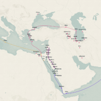
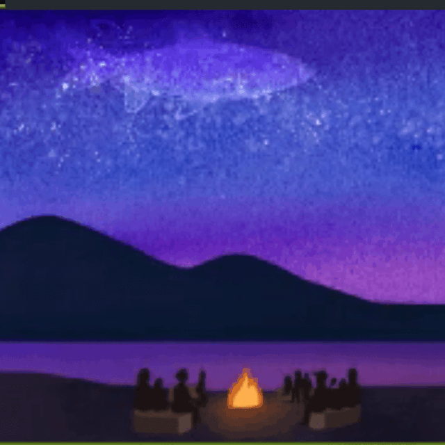
The next presentation featured Hitch Stories, a project led by Sara Dassanayake, Tara Mallela, Jocelyn Garcia, and Dr. Jeremy Sorgen. This research is an intergenerational and community-centered storytelling project that collaborates with the Pomo Tribal Elders and youth of the Clear Lake region of California. Together, the team and community document histories of Pomo resilience against land and water damages, and the community’s relation to the endangered hitch, or chi, fish.
Tribal elders noticed the hitch population plummeting from habitat destruction at Xabatin, or Clear Lake, after environmental disputes with settler governments. The tribe asked Dr. Sorgen and their team to archive the community’s stories of the hitch fish. The hitch fish used to be a food staple for the Pomo community; however, mercury contamination at the lake, habitat destruction, and other damages to the land and water have made it difficult for the tribe to continue to fish for hitch. Nevertheless, the fish continues to be a cultural resource for the tribe and an important part of their oral history tradition.
The project records stories from tribal elders to share with tribal youth to preserve their cultural tradition around hitch fish. The project also includes artistic animation to support the storytelling of elders. The animator, Jocelyn Garcia, identifies as a member of the Pomo community and felt grateful to hear these stories since they have not been able to experience fishing for hitch, given its endangered status. Ms. Garcia shared an early view of the animation, which explains how the fish is a gift to understand our connection to Creation and other beings, and how destruction of the land affects the Pomo cultural tradition. Ms. Garcia explained how they use watercolor painting with digital drawings to create these stunning animations.
Next, Ms. Mallela explained her work to explore the Hearst Museum of Anthropology Archive and UC Berkeley Bancroft Library Archive for information about the hitch fish, and difficulties she faced through this process. She encountered poorly-identified archival materials and restricted access, which highlighted issues of accessibility and equity for youth of the Pomo community to see historical information about their tribe and environment. Since the project is sharing tribe-centered perspectives, the project’s Hitch Stories StoryMap is a key resource to make these archival materials more discoverable for the community’s youth.
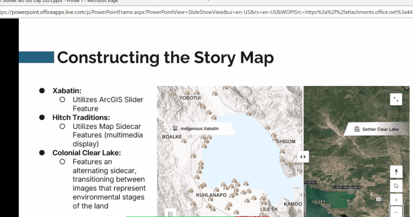
Finally, Ms. Dassanayake presented on how their team created the StoryMap in ArcGIS using the Slider feature to show changes between Indigenous and settler map views of Xabatin, or Clear Lake. The slider tool further emphasizes the extent of environmental changes around the lake. Other sections of the StoryMap show climate impacts on the land, and archival documents and oral histories of tribal elders sharing the tribe’s cultural traditions around the hitch. Ms. Dassanayake encountered challenges of adding pre-1600 data about the lake into ArcGIS, since the archival data had a eurocentric view and had fewer materials representing tribal perspectives. Also, she had to custom-make iconography that appropriately fit the Indigenous representation of the map. Finally, Ms. Dassanayake explained that their team intentionally took a salvage and community approach to ensure the project is working to uplift traditional Indigenous knowledge and protect Xabatin from future harms.
One member of the audience asked about the origin of the project and how the team got involved. Dr. Sorgen explained how tribal elders saw the issue of the hitch fish declining, held an emergency meeting, and asked agencies and academics to come to task to help improve the hitch population. Dr. Sorgen and their team were invited in to help document the cultural tradition around the hitch. On a personal note, I particularly enjoyed this presentation since I learned new information about the Pomo community’s cultural tradition, information that typically has been erased or made inaccessible, such as the original name of Xabatin and the important role of the hitch to the Pomo community’s resilience.
The next presentation was led by Dr. Eric L. Piza, Professor of Criminology & Criminal Justice, Director of Crime Analysis Initiatives, and Co-Director of the Crime Prevention Lab at Northeastern University. Dr. Piza’s presentation explored the Criminology of Place and how GIS improves public safety by identifying the features of places where criminalized activity tends to occur. This research explores how place shapes the occurrence of criminalized activities. Research has shown that criminalized activities tend to occur in certain places, and the nature of the place can shape whether or not, or how, the criminalized activity takes place. Dr. Piza explained that criminologists refer to place as meaning a small, micro-level space, like a street segment, or road intersection. This micro-level geography is the resolution that is typically used to analyze criminalized activities in urban settings.
For example, in Boston, a map of shootings by neighborhood shows Roxbury, Mattapan, Jamaica Plain, and Dorchester as having the highest rates of shootings. However, when examining the street-level data of shootings, one can see that criminalized activity occurs in very specific places, not evenly across the whole neighborhood. For policymakers, knowing the conditions of the place that shaped the occurrence of crime—in addition to talking with affected individuals and examining the societal factors that influence criminalized behaviors—can help create policies to reduce criminalized activities.
One of Dr. Piza’s projects focused on opioid overdose patterns in Paterson, New Jersey. They identified that a larger proportion of the EMT calls to respond to overdoses, about 26%, occurred in a smaller area of the city, about 3% of the city area. This allows policymakers to target the areas with the highest rates of EMT responses to overdoses with a high-impact policy intervention.

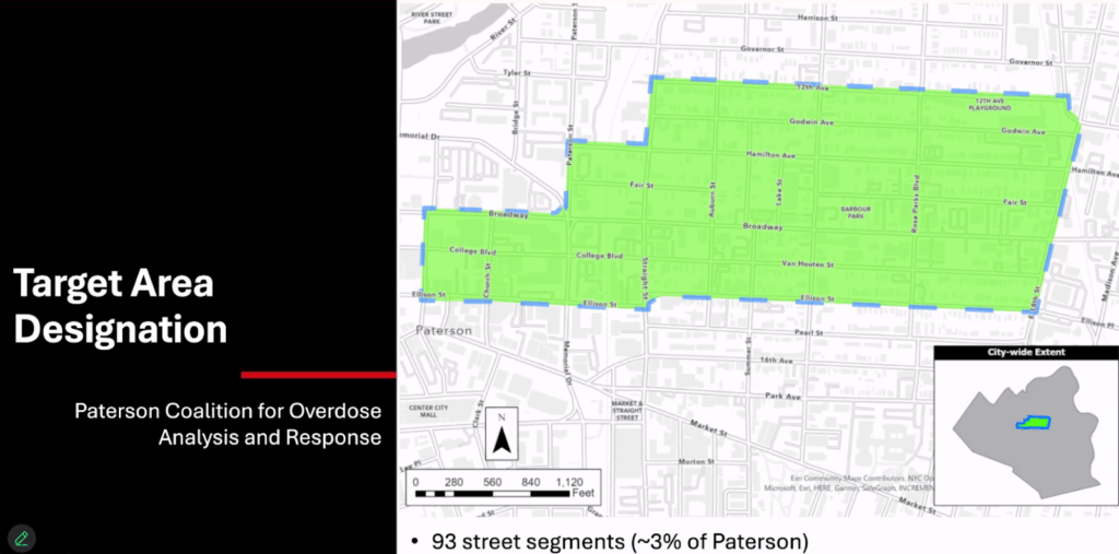
As a result of the target area analysis in Paterson, local stakeholders decided to station case workers at specific corners of the target area to provide resources to those affected by addiction. As someone trained to examine the broader societal factors shaping behavior, I wonder how historical and cultural factors may influence rates of criminalized activities in certain geographies, and how GIS can be further used to help individuals struggling with drug addiction.
In another case, Dr. Piza worked with the Wauwatosa Police department in Wisconsin to identify hot-spot areas with high rates of criminalized activity, park police cars in these hot-spots for 15 minutes, and examine the impacts. Research has shown that simply the presence of a police vehicle can reduce instances of criminalized activity.
To measure police presence, Dr. Piza’s team used GPS trackers on patrol cars to measure when and where each vehicle patrolled and stopped within hot-spot areas. They identified that this strategy significantly reduced rates of criminalized and non-criminalized incidents like crashes and social disorders (e.g., public drinking and drug use, minor vandalism, etc.).
One member of the audience asked about the nuance of tracking overdose locations versus tracking the prior locations of drug transactions, and how their team is taking on this complexity. Similarly, the question-asked wanted to know how their team can explore relational effects of other threatening presences, like ICE, in hot-spot areas. Dr. Piza explained their team is connecting overdoses to locations of other criminalized activities by tracking affected individuals’ locations across the city to understand how place shapes the behavior of individuals affected by drug addiction.
Following the presentations and a lunch break, in-person and virtual attendees had the opportunity to see works submitted to the StoryMap Competition and vote for their favorite entries. The following entries placed in the top three of the competition:
Breathing Crisis in Dhaka: Visualizing Air Pollution Patterns in Dhaka, Bangladesh by Tasnim Ahmed won third place and the Audience Choice favorite award. Hitch Stories, by Sara Dassanayake, Tara Mallela, Jocelyn Garcia, and Dr. Jeremy Sorgen came in second place. The first place winner was Spurring the Grid: A Spatial Exploration of Black Businesses in Oakland, San Francisco, and San Diego by Innocencia Ashai.
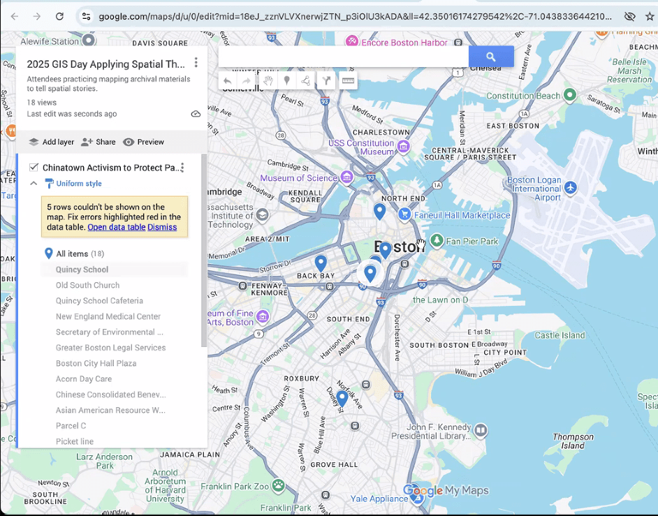
After the StoryMap Competition, Alyn Gamble and Molly Brown led a workshop on using archival information in geospatial analyses. The workshop highlighted examples of StoryMaps made by local government and non-profit using archival materials, such as the Boston Snow Journal and the Nature Conservancy StoryMap on Community-led Conservation of Freshwater Fisheries. For the workshop, in-person attendees were able to explore reproductions of archival materials to see how stories of Boston can be retold with digital maps. Ms. Brown showed examples of the land struggle behind Parcel C in Boston’s Chinatown, as well as the story of Freedom School Stayouts in Boston, as local histories that attendees can explore for geospatial information. Workshop participants then added geospatial information to a shared spreadsheet to create digital storytelling maps of the Parcel C protests and the Freedom School Stayouts. Through this process, workshop participants identified the challenges of getting specific spatial data from archival data and needing to triangulate historical locations with other archival materials.
The resulting maps, produced with Google My Maps, illustrate spatial patterns within Boston’s histories around the Parcel C protests and the Freedom School Stayouts. When making the map of Parcel C activism, the group identified some outlier locations in Roxbury, the North End, and Back Bay where events occurred to support activists and activism in Chinatown. This suggests that activism for Parcel C may have spread beyond the neighborhood of Chinatown, and that activists involved in the fight were coordinated with different groups around the city.
Similarly, workshop attendees identified how Freedom School activism around Boston was not tightly constrained to one area; rather, the mapping activity showed a larger interest in Freedom Schools around the wider Boston area. The map revealed how Freedom School networks may have been organized spatially to benefit certain communities around the city and neighboring areas, and the amount of local organizing required to maintain a large network of Freedom Schools.

GIS Day 2025 concluded with attendees expressing how fun the workshop was, the novel thinking required to map archival materials, and their excitement to apply geospatial analyses to different topics in the future. I thoroughly enjoyed seeing the excellent presentations and StoryMaps, and exploring the challenges and insights of using archival materials for geospatial analyses. To stay involved with the NULab and NU Libraries (and attend amazing events like GIS Day), check out the NULab Events Calendar and the NU Libraries Calendar.