By Devin Gaffney
Several months ago, I was asked to deliver a presentation on how to use the open-source network analysis tool Gephi. In response, I created a GitHub repository (or project for the uninitiated) to contain sample raw network data required for giving Gephi a test drive. You can find the repository here.
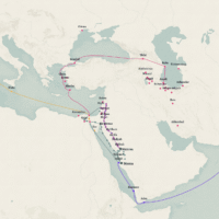
In addition to being asked to deliver a presentation, I’ve also been asked to create a blog post walkthrough of the presentation so that those who may not have been present can also get their hands dirty with Gephi. So, let’s go! The dataset that I provide in my GitHub repository (again, you need this, and it’s located here) is based off of Kieran Healy’s excellent blog post, “Using Metadata to find Paul Revere”. If you haven’t read this before, I would implore you to stop here and read that first – it’s a fantastic piece that explains the types of powerful ways in which we can use network analysis. If you’re not going to read it right now, let me summarize the network structure we will be playing with: there are two networks in the repository (paul_revere.csv/gexf and paul_revere_projection.csv/gexf). The first is a map of individuals in the northeast US in the revolutionary period, and different “suspect” groups that they were members of at the time (this data is from the perspective of the British army, to whom, of course, the founding fathers were traitors). This type of map is called a bipartite network – people are tied to groups, and groups are tied to people (there are two “types” of nodes, in other words). The second graph is a bipartite projection – people tied to one another *through* the groups they co-occur in. The first graph shows us the actual structure of the group, but the projection shows us the latent social structure through who knows whom via the groups they are a part of.
Phew! Ok. There’s some questions that we can obviously ask of this graph and some limitations of the graph that we need to get out there right away. First, what can this graph tell us about the social network between likely revolutionaries at the outbreak of the war? And second (only to keep you aware that social network analysis, as any type of analysis, always omits potentially relevant aspects), what/whom is not in the graph, what is the degree to which the data are accurate, etc.
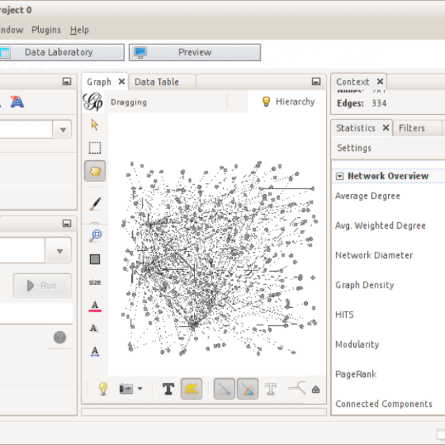
First, let’s open Gephi. After opening Gephi, click File -> Open… and navigate to the downloaded copy of the GitHub repository – open paul_revere.gexf. You should see something that looks similar to this:
Depending on the operating system you’re using this may look a bit different. After some consideration, I have decided that there are four principal steps in using Gephi. Analysis, Sizing and Coloring, Layout, and Export. There are some advanced steps as well, but I leave those for you to figure out from the presentation slides (they aren’t too hard to figure out once you start getting a feel for Gephi) – try out some of the stuff beyond the basics on your own! For now, though, let’s go through the four basic steps.
Analysis
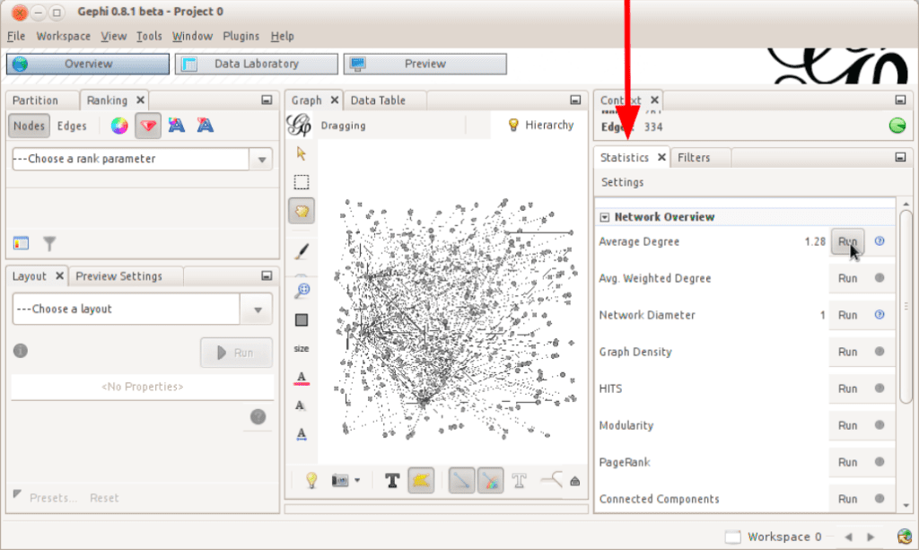
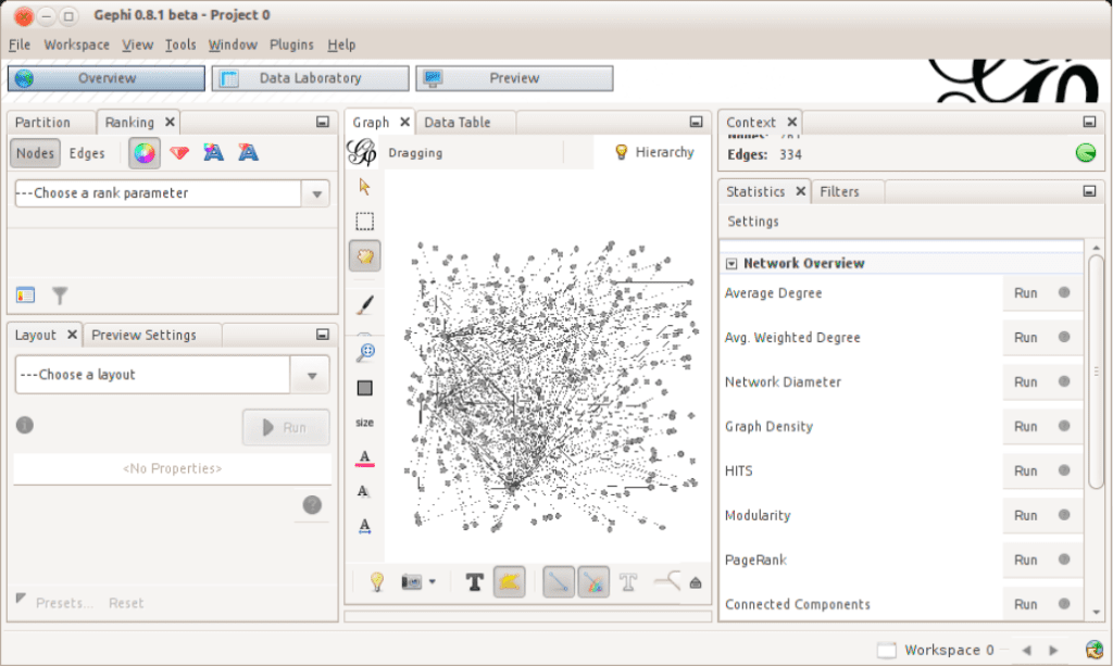
From Gephi’s principal menu, select Window -> Statistics. This will highlight the Statistics window, which should be located close to what is in the above photo. This “window” is a set of different popular algorithms that can be run on network graphs. They are found in many popular academic articles analyzing networks and can be applied to our graphs here. Each one has a description, report, and information for learning more about what they do. For now, I would suggest that you simply run as many as you can – the only way to learn what works is to do so experientially, so running these and seeing what they do in subsequent steps is probably the best way forward. Click “Run” for Average Degree, Network Diameter, HITS, Modularity, and PageRank. That’s about it for this step for now!
Sizing and Coloring
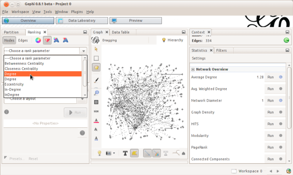
For this next step, click on Window -> Ranking, and you’ll see something similar to the screenshot above – after we have run the statistics from the first step, we are now able to reflect the values of those statistical results into the graph at hand. The highlighted attribute above, “degree”, is simply the number of links inbound to or outbound from a particular node. Note the highlighted “ruby” icon above the drop-down – for better or worse, Gephi uses that symbol to denote the size of nodes. So, here we are about to visually map the degree of nodes into the size of the nodes. Larger degrees for nodes will map to larger nodes, in other words. To the left of the “ruby” icon is a palette icon – this will do the same thing but for a color spectrum – nodes that have larger degrees could be redder, while smaller ones could be bluer, for example. Finally, some coloring options are categorical – when we ran modularity, we assigned each node to a distinct community that they are members of – go ahead and click on Window -> Partition – click on nodes (which should be already clicked), click on the “recycle” icon (which is bizarre but it’s Gephi, so…), and then select “Moularity Class” from the drop-down. Click “Apply” and this will now color the nodes by the groups or communities they belong to. Feel free to jump between steps one and two, manipulating the statistics and the various inputs and variables they take and the subsequent sizing and coloring results until you feel satisfied.
Layout
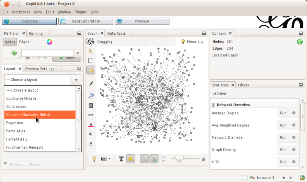
The next step is Layouts – click on Window -> Layout, and you’ll see the layout panel selected. This allows us to move away from the random layout that Gephi places nodes in by default and move towards something more visually pleasing and hopefully informative. For now, let’s try out Force Atlas without editing any of the variables – select force atlas, then click on run – you should see the nodes start moving around. Eventually, the algorithm will finish, but if you’re impatient you can always click “stop” to leave the nodes in the place they currently are. Try changing variables for Force Atlas – each one has a little hover description for what it controls in as plain language as possible – and also try other layouts – note that you can also run one layout after another to try to get the best of several techniques.
Export
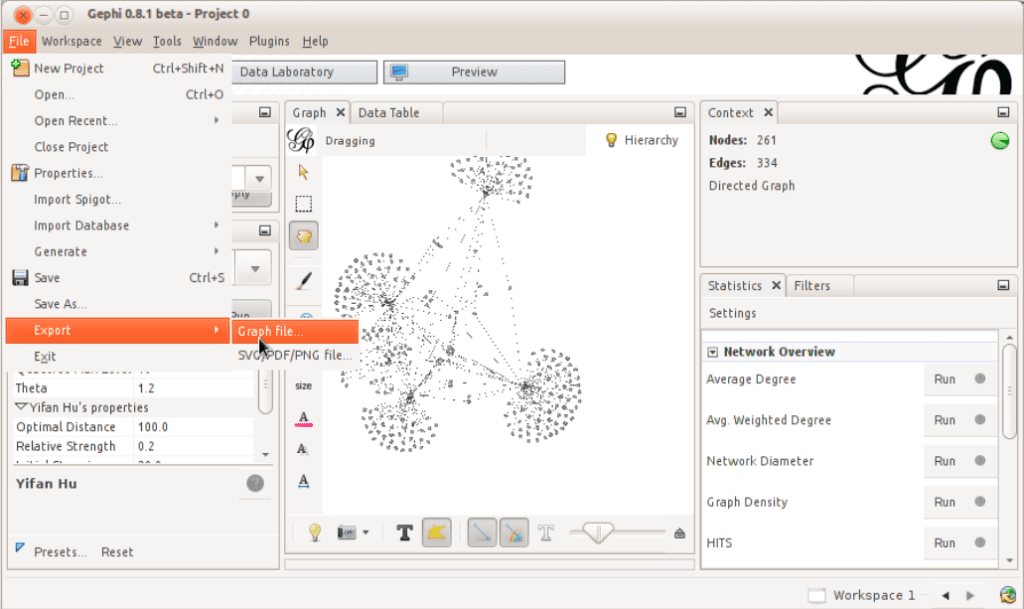
Finally, I want to note a few things about exporting networks. There are several types of exports – ones that are visual and ones that are data-based. Visual ones can be controlled via the Window -> Preview Settings option – this allows for us to create a snapshot of the graph as it stands now. Click refresh on this now, then click on Window -> Preview – you should see a visual representation of the graph. If you’re not seeing it, click on the Refresh button again on the Preview Settings section – sometimes you may have to click it several times due to a Gephi-specific quirk. To export the visual graph, click on SVG/PDF/PNG from the Preview Settings window. This allows you to experiment with various options for exporting pictures of your graph – go ahead and try several export strategies, and be sure to click on Options… in the bottom right of the export window to see interesting and useful options for the export. Exporting the graph as data is much more straightforward – from the principal menu, select File -> Export -> Graph file. Again, there are too many options to go over in detail – the best way to use them is to explore them yourself and see what types of output they create. In my experience, GEXF has been the most stable and portable export strategy while maintaining fidelity to all of the unique peculiarities of one’s graph, but there may be utility in other strategies. I encourage you to try to find those cases!
Be sure to also check out the advanced steps in the PDF file in the GitHub repository, and thanks for reading through this quick walkthrough about the Gephi network analysis tool!