
By Jonathan D. Fitzgerald
On this day, 147 years ago, Volume 15, Number 10 of The Raftsman’s Journal was published in Clearfield, Pennsylvania. Among the stories featured on its front page were a short work of fiction called “The Dashford Tragedy”; a vignette titled “Who Ate Roger Williams”; a poem, “Marjorie’s Almanac”; and “A ‘stunning’ Love Letter,” described by the editor—hyperbolically, though not inaccurately—as “sublimely ‘spendiferous.’” More on the love letter in a moment.
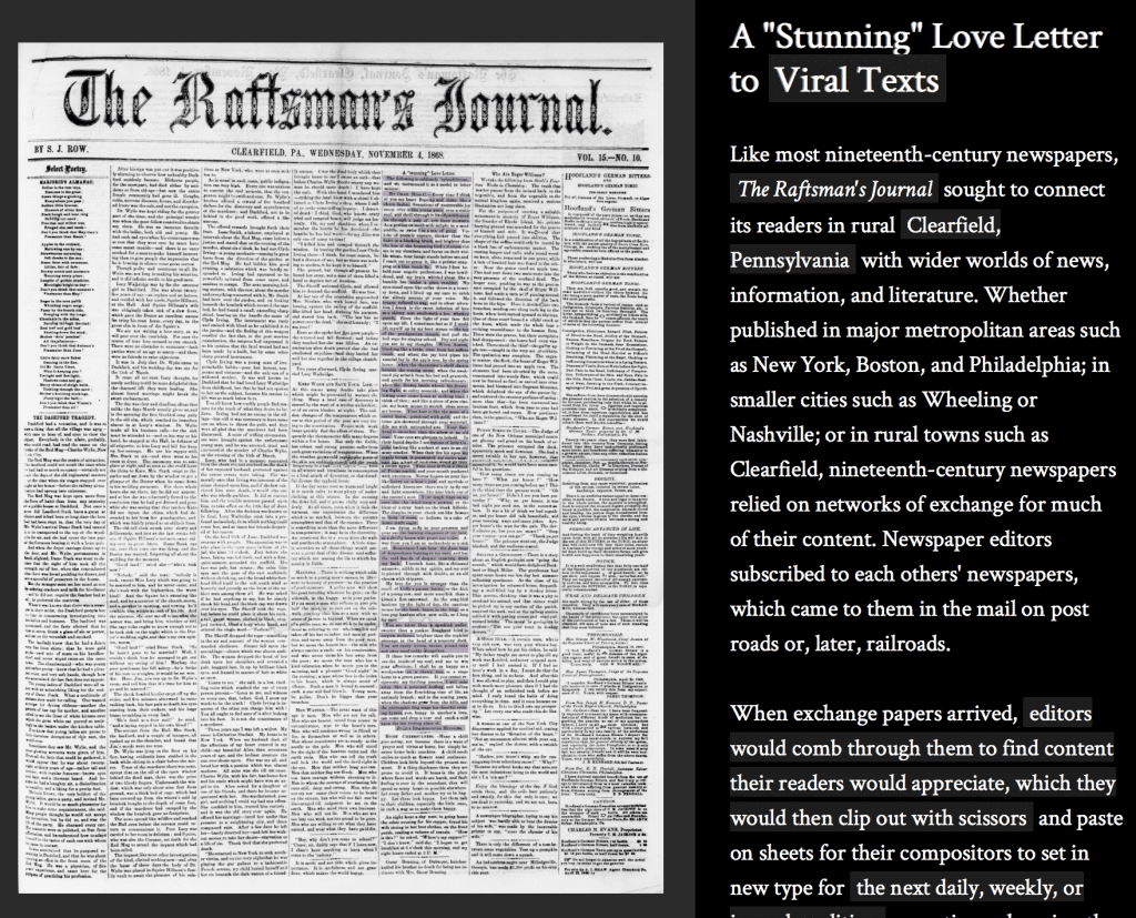
There is nothing particularly remarkable about the November 4, 1868, issue of The Raftsman’s Journal. Like most newspapers, it would have been read and then discarded by those within the reach of its circulation, while its editors would have mailed a copy to other newspaper editors around the country, which is, after all, how the common practice of reprinting articles from other periodicals was done in the 19th century. And yet, that it is in many ways a typical 19th-century American newspaper is one of the reasons my colleagues and I on the Viral Texts Project chose it to use as an entry point for the public to the data we are immersed in.
The Viral Texts Project, led by NULab Core Faculty members Ryan Cordell and David A. Smith, is concerned with mapping networks of reprinting in 19th-century newspapers. Or, as the name of the project suggests, we’re looking for texts that went viral in the 1800s. To this end, we work with a lot of data in the form of clusters of reprinted stories, poems, lists, recipes, jokes, religious material, and articles from the era. A perennial problem for us has been how to make this data accessible to those outside of our project.
We have created some large-scale visualizations such as maps of reprints over space and network graphs of reprints, but we hadn’t created any intensely local visualization of the data for the purpose of providing a narrow entry point into the larger corpus.
That is until, while hand-tagging a subset of clusters by genre, we came across the “sublimely ‘splendiferous’” love letter. This is really, for a lot of reasons, a remarkable piece. It is a satirical letter offered, in various iterations, as a model for a young man trying to impress a woman. It includes such over-the-top metaphors as: “Your forehead is smoothar [sic] than the elbow of an old coat” and “Away from you I am as melancholy as a sick rat.”
Professor Cordell, my fellow graduate researcher Abby Mullen, and I decided to use the love letter to create a visual introduction to the Viral Texts data—a light-hearted entry point into the dense data we’d been studying—using Neatline. Bethany Nowviskie, in a blog post titled “Neatline & Visualization as Interpretation,” describes Neatline as “a digital storytelling tool” that “lets you make hand-crafted, interactive stories as interpretive expressions of a single document or a whole archival or cultural heritage collection.”
Using our online database, we searched for other reprints of the love letter and found that it was printed in more than 60 newspapers around the U.S. After looking at several, we chose the version found in The Raftsman’s Journal as our base image—and conceptual starting point—for a number of reasons, including the clarity of the image from Chronicling America and the variety of content printed on the front page. While we wanted to showcase the diversity of the genres available in our data, we didn’t expect to find that nearly every item on the page appeared at least once elsewhere in the corpus. Most of the time when working with our data, we’re looking at spreadsheets or running queries into large data frames, but working at the level of the individual page and tracing the connections out from there allowed us to see a quality of the data that the spreadsheets do not reveal.
In order to really show just how thickly reprints dominated this page, we had to literally draw boxes around each article and then delve into our data to annotate each item. In “Neatline & Visualization as Interpretation,” Nowviskie writes, “Neatline sees visualization itself as part of the interpretive process of humanities scholarship – not as an algorithmically-generated, push-button result or a macro-view for distant reading – but as something created minutely, manually, and iteratively, to draw our attention to small things and unfold it there.”
This is precisely what we hoped to do with the love letter. It is a small thing, not even one full column on the front page of a long-defunct newspaper from the middle of Pennsylvania, but it folds out to the vast corpus of 19th-century newspaper texts. We don’t make any claim toward the completeness of the annotations, and the dataset that we link to is not our entire corpus, as it continues to grow, but hand-annotating this data—“minutely, manually, and iteratively”—was a productive interpretive process that allows us to look at this “small data in a big data world,” as Nowviskie puts it.
Of course, in addition to all of this, it was a fun project. One that, as Julius Epaminondas Muggins—our fictional letter writer—says of his love, made our hearts flop “up and down like a churn dasher” and caused “sensations of unutterable joy [to] creep over [them] like young goats over a stable roof.” We hope that you’ll find this interpretive act similarly informative, enlightening, and, of course, “sublimely splendiferous.”
Check out “A ‘Stunning’ Love Letter to Viral Texts” here.


